Typography- Task 2: Typographic Exploration & Communication (Text Formatting and Expression)
12.05 .2023 – 26 .05 .2022 / Week 6 – Week 8
LIM CHAEHWAN / 0363792
Typography / Bachelor of Design in Creative Media (Hons) / Taylor's University
Task 2: Typographic Exploration & Communication (Text Formatting and Expression)
LECTURES
Refer to task1
INTRODUCTIONS
<iframe src="https://drive.google.com/file/d/1ERcokXlxbO9Vkfp2z0JpI2EWyr3vtAa8/preview" width="640" height="480" allow="autoplay"></iframe>
EXERCISE
For Task 2 option as below:
1. The role of Bauhaus thought on modern culture
2. A code to build on and live by
3. Unite to visualize a better world
After reading all three columns,
I chose the number two " A code to build on and live by" that I liked the most
Initial Process (research, layout sketches)
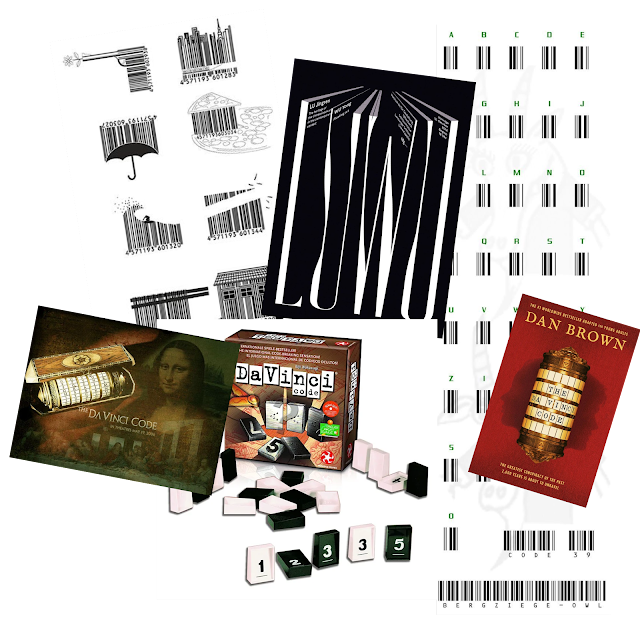
Fig.1.0 Research for headline design
I conceived two designs for the headline. Among the words that make up the headline, the first is a design with a barcode motif, and the second is a design with a board game and a movie motif called Da Vinci Code.
Fig.1.1 layout sketches
And I sketched the layout design by referring to the book Basics Design: Layout (further reading)
Process to design
-Headline illustrate
Fig.2.0 Headline illustrate
Through the Adobe Illustration Program, I worked to make the code look like a barcode.
-Layout
Fig.2.1 Task 2. Option 1
This is my early design, and I came up with a new and simple design with feedback that I realized the problem of spacing and layout between letters.
Fig.1.0 Task 2. Option 2
It is a design based on the second idea, the Da Vinci Code. In Korea, a board game called Da Vinci Code is famous, and block pieces representing each code are expressed in code. I liked it because it looked simple and neat and comfortable to look at.
Margins:10mm
Gutter:5mm
Head
"Code" Font: Baskerville / Bold
"A/ To Build on and Live By" Font: Baskerville / SemiBold
Paragraph Heading
Font: Baskerville / SemiBold Italic
Font: Baskerville/ Regular
Body
Font: Baskerville/ Regular
Type Size: 9 pt
Leading 11 pt
Characters per line: 63
Alignment: Left Justified
FINAL Editorial Spread
Fig 3.0, Final Editorial Spread
Fig 3.1, Final Editorial Spread(PDF)
Fig 3.2, Final Editorial Spread (Grids)
Fig 3.3, Final Editorial Spread (Grids PDF)
FEEDBACK
Week 6:
General Feedback: It is better to find the correct answer in a simple design rather than a too-complex design. Be careful when using justify.
Specific Feedback: Incorrect line spacing and body text lagging can be explored by tilting the angle.
The font is distorted.
Week 7
General Feedback: Remind us to follow the guideline and instructions with the given samples while we submit our task. And for Task 2, the Headline conveying the meaning is important. Watch the feedback session to get the knowledge in order to make our own judgment on our work.
Specific feedback: The layout is okay, the size and kerning had to redo again.
REFLECTIONS
Experience:
I thoroughly enjoyed the process of designing the editorial spread, especially with the added freedom of choosing from three different texts and having more space to work with. As I conducted my research, I felt a growing eagerness and excitement when I encountered interesting layouts. It even sparked the idea of designing some layouts of my own. One of the challenges I faced was creating something unique, considering that all of us were using the same three different texts. However, this challenge made me realize that the same text can be expressed in various ways. It allowed me to explore different interpretations and approaches to design, leading to more diverse and innovative results. Throughout Task 2, I discovered the importance of considering the design's aesthetics and readability/legibility. I learned that these two aspects should be given equal weight to create a successful design. While it is essential to create visually appealing layouts, it is equally crucial to ensure that the text is clear and easily understandable for the audience.
Observations:
Observing my peers' work, I noticed that their designs often reflected their personalities. This realization emphasized the individuality and personal touch that designers bring to their work. It made me more aware of my design style and encouraged me to express myself authentically through layouts.
Findings:
In summary, designing the layout in this typography class provided me with a range of valuable insights. I learned to appreciate the diversity of interpretations for the same text, recognized the influence of personal style, and discovered the significance of balancing aesthetics and readability. Moreover, I realized the importance of originality and the role of research in fostering creativity. This experience has deepened my understanding of typography and its impact on design, and I look forward to applying these learnings in future projects.
FURTHER READING
1. Typographic Communications Today
Fig.4.0 Typographic Communications Today (The MIT Press) Hardcover-February 10, 1989
Fig.4.1 Typographic Communications Today (bauhaus)
Fig.4.2 Typographic Communications Today (grid system)
2. Basics Design: Layout
Fig.4.3 Basics Design: Layout Paperback – January 1, 2005
Fig.4.4 Basics Design: Layout
Fig.4.6 Basics Design: Layout (alignment)
Reference
1. Typographic Communications Today (The MIT Press) Hardcover-February 10, 1989
2. Basics Design: Layout Paperback – January 1, 2005


.jpg)
.jpg)


Comments
Post a Comment