Advanced Typography/ Task2

29.06.2023 – 07.11.2023 / Week 5 – Week 9
LIM CHAEHWAN / 0363792
Advanced Typography / Bachelor of Design in Creative Media (Hons) / Taylor's University
Task 2: KEY ARTWORK AND COLLATERAL
LECTURES
Lectures 1 to 5 completed in Task 1/ Exercise 1 &2
INTRODUCTION
Task 2A: Key Artwork
Mind Map
I've created a mind map to help me explore words that represent me in Wordmark, my usual interests, and my styles. It indicates the identity of the wordmark.
 Fig. 1.0 Mind map

Research
 Fig. 1.1 Research
Key artwork idea concept:
Among the Chinese characters of my Korean name, there is a meaning of shining 煥, also my English name Selena means the moon. That's why I thought of the shining moon at first. I thought about what would be an effective expression of the shining moon and came up with the idea to design it by referring to the tarot card's owner and the tarot card with the moon and stars that I was interested in.
In the typography class of the previous semester, I realized that straight and constant writing looks good, so when I designed the writing this time, I started by making a square frame.
It also symbolizes the rectangular shape of the tarot card.
Mood Board

Fig. 1.2 Mood board
Key Artwork
I set guidelines like the rectangular shape of a tarot card and made a shape using the pen tool of the illustrator.


Fig. 1.4 Guide line Artwork

Fig. 1.5 Make an ornament like a tarot card
I started by creating a square frame as a guideline when I started working.
Then, I made a small rectangle on the four corners and tried to design it like an ornament on a tarot card of a certain size.
Key Artwork (KA) in BW & color


Fig. 1.9 Final key artwork - PDF (Week 7, 18/5/23)
Task 2B: Collateral
Mr. Vinod emphasized the scalability and design change, so I focused on designing it.
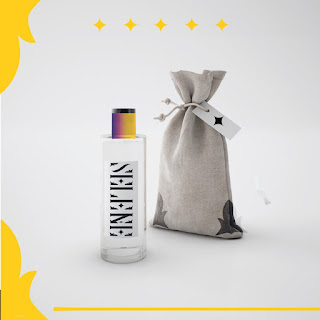
Since the concept of my key art walk is a tarot card, I thought of scented candles and perfume goblet glasses as collateral.
*Please refer to the fact that there are 2 colors each after changing the color palette after the Instagram design*

Fig. 2.0 Failed attempts of collateral

Fig. 2.1 Process to make collateral (3D)

Fig. 2.2 Process to make collateral
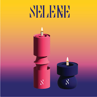
Fig. 2.3 Reselected color of collateral (candle)


Fig. 2.6 Original Photo

During the independent Learning Week, we must print our task 2 key artwork on a t-shirt. I went to the place where I could print the teacher's personally.

Fig. 2.8 Key artwork on a T-shirt

Fig. 3.0 Animation process

Fig. 3.1 Final Animation gif
IG handle


I decided on a profile picture with a yellow background because I thought it was the best way to express myself. After all, the point color and the representative element, the star, is yellow.


Week 4 General Feedback: Find your own research image, find your meaning Specific Feedback: The wordmark needs stability and form.

Fig. 4.0 First color palette

Fig. 4.1Photoshop works my eyes

Fig. 4.2 Apply Multiply to the original file

Fig. 4.3 Editing in Ai IG file
IG along with my collateral

Fig. 4.4 First attempt IG account
At first, I made my account name imselene_official
because my surname is Lim, it sounds like I'm
But my account was hacked so I created a new account called ims.elene
And also, I changed the color palette after receiving feedback that it was not effective because the contrast of the colors was not large. It's better when I use contrasting colors.

Fig. 4.5 Reselected color palette
Fig 4.6 Final IG account
Final IG handle
Fig. 4.7 Instagram - Profile icon
Fig. 4.8 Instagram - post 1
Fig. 4.9 Instagram - post 2
Fig. 4.10 Instagram - post 3
Fig. 4.11 Instagram - post 4
Fig. 4.12 Instagram - post 5
Fig. 4.13 Instagram - post 6
Fig. 4.14 Instagram - post 7
Fig. 4.15 Instagram - post 8
Fig. 4.16 Instagram - post 9
Fig. 4.17 Final Task 2B - PDF
FEEDBACKS
Week 4 General Feedback: Find your own research image, find your meaning Specific Feedback: The wordmark needs stability and form.
Week 5
General Feedback: Find appropriate colors through Color Hunt and gradually expand the design.
Specific Feedback: The design process must be recorded.
Week6
General Feedback: Extend the term to encompass aspects relevant to my personal identity. Elaborate; refrain from arbitrarily imprinting your emblem on unrelated materials.
Specific Feedback: Make a variety of changes and expand
Week7
General Feedback: Try to use Instagram to entice people to look further at the product.
Specific Feedback: There's no contrast in color, it's too minimal, and there's a lot of empty space
Week 8 Independent learning week no feedback.
REFLECTION
Experience:
Embarking on the journey of creating my wordmark “Selene” was an exciting experience that allowed me to immerse myself in the fascinating realm of visual communication and artistic self-expression. The process of distilling my personality into design has been challenging yet rewarding. Creating art that truly reflects who I am feels similar to creating personalized merchandise. This is a fun and enjoyable endeavor.
Observation:
The task underscored the significance of finding purpose in design expansion. It became clear that every extension of the design should have a defined purpose and rationale, serving as a roadmap for further creative exploration. Without a clear intention, the expansion process can become disjointed and lack the depth necessary for meaningful growth.
Findings:
This experience illuminated the delicate balance required in design expansion—maintaining continuity while introducing new elements. It taught me that successful design is not just about creating aesthetically pleasing visuals but about crafting a comprehensive and purposeful narrative that can seamlessly evolve and expand. The evolution from a static wordmark to dynamic collateral and GIF underscored the intricate dance between creativity and purpose. It was a journey of experimentation, balance, and purposeful choices, illustrating that design is not merely about aesthetics but a harmonious interplay of elements that tell a compelling and dynamic visual story.
FURTHER READINGS

Fig. 5.0 Typography referenced- Haley, Allan.;
I chose to read this book because I wanted to find out about the various design possibilities of typefaces
Through this book, I read various references, and it was an opportunity to review the history and principles of typos that I learned before The most impressive part is the typography pairing, which was amazing to express effectively with contrasting fonts.
.

Fig. 5.1 type reference

Fig. 5.2 Typeface weight variants
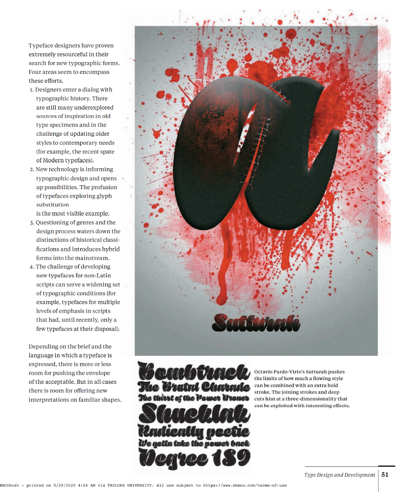
Fig. 5.3 Interesting typeface design

Fig. 5.4 type contrasted

Fig. 5.5 typeface pairing


Comments
Post a Comment