Typography - Task 3: Type Design & Communication

LIM CHAEHWAN / 0363792
Typography / Bachelor of Design in Creative Media (Hons) / Taylor's University
Task 3: Type Design & Communication
LECTURES
Week 8 :
For our upcoming class, we were advised to bring five writing tools that have varying nibs.

Fig.1.1 tool types
I chose semi-broad, standard fine, brush, round, and compass which is an experimental tool

Fig.1.2 Order of lines

Fig.1.3 x height
Week 10:

Fig.1.4 Font lab interface
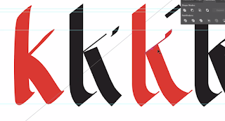
Fig.1.5 Font example

Fig.1.6 Font kerning
Week 11 :
In class, we were given a tutorial on how to export our font and type it on Adobe Illustrator, to create our A4 poster.
Requirements for poster:
- A4 and only black & white
- all words must be the same font size
- can change the angle
- can use Helvetica, 12 pt, 14 leading (when writing your name and font name)
- must have an impact
- size matters
.
INTRODUCTIONS
EXERCISE
1. Exploring
Before I started, I wrote diagonal, horizontal, vertical, and circular lines in five different ways for each tool, AOTMX writing in five different ways for each tool, one option out of five different options, and wrote "a e t k g r i y m p n " in the style we chose. You have selected the last uppercase or lowercase letter you want to create, and you have envisioned a design.


Fig.2.0 Task 3 reference


Fig.2.1 Task 3 reference
While studying the font, I searched not only the alphabet but also the font of my native language,
Korean (ㄱ, ㄴ, ㄷ, ㄹ, ㅁ, ㅂ, ㅅ, ㅇ, ㅈ, ㅊ,ㅋ,ㅌ,ㅍ,ㅎ )

Fig.2.2 Task 3 reference
I also referred to the Instagram account that Mr. Vinod sent us

 Fig.2.3 Exploring Typography(strokes)
Fig.2.4 Exploring Typography(strokes)
After hearing the professor's feedback, I chose the 2nd brush out of the 5 tools and kept practicing.

Fig.2.5 Final option from my practice

2. Digitalization

Fig.3.0 process #1

Fig.3.1 process#2

Fig.3.3 Digitalization

Fig.3.4 Google font reference

Fig.3.5 Comparison of development processes

Fig.3.6 after feedback #1
To make a font family, I started to design "a e t k g r i y m p n / A E T K G R I Y M P N and a special symbol. : , . ! #
3. Developing the final font in FontLab 7
 Fig.3.7 make a kerning(before)
 Fig.3.8 make a kerning(after)


Fig.3.9 My font in the font book


Fig.4.0 two versions of the poster
Measurements (from baseline)
Ascender: 692 pt
Caps height: 661 pt
X-height: 453 pt
Median: 500 pt
Descender: -186 pt
Final Task 3A: Type Design and Communication
1. Font download:
https://drive.google.com/file/d/1ejNe6pCDQ9QyYaJ-GUI0AlgtCTVaiqGG/view?usp=sharing
2. Ai generated construction on art board (JPEG, 1024px, 300ppi)

Fig 5. Ai generated construction on art board (JPEG)
3. Screen grab of "New Metrics Window" with sentence

Fig 7.13 Screen grab of "New Metrics Window" with sentence
4. Ai generated A4 poster

Fig 7.14 Ai generated A4 poster (JPEG)
5. Both Ai generated artworks in PDF
Fig 7.15 Ai generated construction on art board (PDF)
Fig 7.16 Ai generated A4 poster (PDF)
FEEDBACK
Week 8
General Feedback: Draw at least three letters per letter.
Specific Feedback: You must make sure your letters sit on the baseline, with descenders and ascenders below or above the baseline. The Y in the second option is weird, doesn’t seem to fit. You will need to now practice writing in that style and later identify the best letters you can use for digitization (when instructed). For now, keep practicing writing in that style.

General Feedback: Mr. Vinod emphasized the significance of aligning the letterforms with the baseline and stressed the importance of comprehending the anatomy of typography while formatting them.
Week 10
General Feedback: Idea sketches, and the process of generating font in Font lab need to be documented in the e-portfolio. Try not to watch the tutorial and do it at the same time, this might cause missing important steps.
Specific Feedback: Don't copy the reference, but keep the feel of the original sketch alive. It's similar, it's different.
Week 11
General Feedback: Please watch all the videos you have provided, and be careful about the angle of the brush.
Specific feedback: keep to descender, median, cap height, ascender
Week 12 :
General Feedback: keep point sizes the same.
Specific feedback: If you want to write a poster in a circular form, make it using a spiral tool
REFLECTIONS
Experience: Creating my font, "Charming," was an immensely enlightening experience. The entire process, from sketching to digitizing, refining, and kerning, proved to be quite challenging. It required a substantial amount of thought and deliberation to develop a well-designed font. However, the invaluable feedback I received from my friends and Mr. Vinod played a significant role in helping me navigate this task. I learned a great deal from their insights alone. Additionally, working with the Fontlab7 software was entirely new to me, and its complex features posed difficulties. Lastly, when it came to designing the poster, I initially felt torn. In Task 1, I enjoyed using different font sizes to express my typography. However, for this particular task, we were restricted to using only one font size for the poster. Nevertheless, this limitation presented a challenge that pushed me to explore innovative ways of employing letter positioning.
Observations: During the refining stage, I discovered that seeking inspiration from other fonts similar to my design proved to be incredibly helpful. Initially, I had doubts, but examining these fonts guided me in determining the appropriate sizes for certain letters and punctuation marks. It also contributed to maintaining typographic accuracy. Furthermore, I realized how laborious the kerning process can be. As individual letters appear distinct when placed next to each other, I had to exhaustively explore all possible combinations and kern them accordingly.
Findings: I found that meticulous refinement of letters and punctuation marks is crucial as it significantly impacts how the font is perceived by readers. For instance, I was previously unaware that the bottom part of the stem in an exclamation mark should be smaller than the top part to emphasize its purpose. Additionally, I discovered the fascinating concept of typographic illusions, particularly overshoots. I learned that letters like "o" feature slightly larger curves to create the illusion of equal size compared to straight strokes. This understanding added depth to my knowledge of typographic principles.
Overall, the process of creating my font, "Charming," provided me with valuable experiences, observations, and findings. It enhanced my design skills and broadened my understanding of font design, software usage, and typographic concepts.
FURTHER READING
-Inspo/resource for Task 3

Fig.1.0 Insta account Merle Michaelis
-Punctuation lesson 29 by GT Academy
Fig.1.1 Punctuation lesson 29 by GT Academy (video)


Comments
Post a Comment