Advanced Typography/ Task1

A contrast of size provides a point to which the reader’s attention is drawn


 02.04.2023 –  20.09.2023 / Week 1 – Week 4

LIM CHAEHWAN / 0363792
Advanced Typography / Bachelor of Design in Creative Media (Hons) / Taylor's University

LECTURES 

Week 1- Typographic Systems

Kimberly Elam Typo systems consist of 8 types.
I usually focus on the grid when I design, but I can do new designs through various permutations and repetitive imaginations. And various systems can be combined.


1. Axial System: All elements are organized either to the left or right of a single axis.

Fig. 1.1 Axial system (source: Typographic Systems-Kimberly Elam)


2. Radial System: All elements are extended from a focus point.
Fig. 1.2 Radial system (source: Typographic Systems-Kimberly Elam)


3. Dilatational System: Textual information surrounds the circumference of a circle.

Fig. 1.3 Dilatational system (source: Typographic Systems-Kimberly Elam)


4. Random System: Elements appear to have no specific pattern or relationship.

Fig. 1.4 Random system (source: Typographic Systems-Kimberly Elam)


5. Grid System: All text is divided into vertical columns and horizontal rows.

Fig. 1.5 Grid system (source: Typographic Systems-Kimberly Elam)


6. Modular System: Text is constructed as a standard size unit which is interchangeable.

Fig. 1.6 Modular system (source: Typographic Systems-Kimberly Elam)

7. Transitional System: An informal system of layered banding or flow system.

Fig. 1.7 Transitional system (source: Typographic Systems-Kimberly Elam)


8. Bilateral System: All text is center-aligned and arranged symmetrically on a single axis.

Fig. 1.8 Bilateral system (source: Typographic Systems-Kimberly Elam)


Week 2- Typographic Composition

Principles of Design Composition
Layout can be emphasized through space, symmetry and repetition are also important.


The Rule of Third

The Rule of Thirds is a photographic guide to composition, it basically suggests that a frame (space) can be divided into 3 columns and 3 rows. The intersecting lines are used as a guide to place the points

Fig. 1.9 The Rule of Thirds

The grid system (or raster system) is one of the essential systems in typography, derived from the grid layout structure of letterpress printing. It was reinforced by the Swiss Modernist style of typography, with key proponents like Josef Müller-Brockmann, Jan Tschichold, and Max Bill.

The grid system is practical and widely used, known for its versatility and modular nature, allowing for infinite design adaptations.

In the postmodern era, there was a reaction against the ordered typography of the modernist era, leading to the exploration of chaos, randomness, and asymmetry. While readability became less critical, some designers sought to harmonize readability and aesthetics.

Designers like David Carson, Paula Scher, and Jonathan Barnbrook played crucial roles in postmodern typography, utilizing chaos and asymmetry to develop a new design language.

of interest, within the given space.


Other models / Systems


Environmental Grid: This system explores various structures by combining curves and straight lines to create unique visual elements. Designers use it to organize information, incorporating non-objective elements for engaging textures and visuals, focusing on environmental aspects related to conveying messages.

Fig. 1.10 Environmental Grid

Form and Motion: Its goal is to remove the seriousness often associated with grid applications and to perceive the arrangement of images, text, and color as animations that replicate the page-turning experience in a book, regardless of whether the pages are physical or digital.
Fig. 1.11 Form and Motion 

Week 3- Context&Creativity

Where is Phoenicia (present-day Syria, Lebanon, and Israel)


General Process of Type Design

1. Research

2. Sketching

3. Digitization 

4. Testing 

5. Deploy

Perception:

Perception in typography involves how

Contrast of size: Contrast in typography utilizes various elements to guide the reader's attention:


  1. Fig. 1.15 Contrast of size
  2. The contrast of weight: Bold type stands out amidst lighter type, providing emphasis.
  3. Fig. 1.16 Contrast of weight

  4. Contrast of form: Differentiates between capital and lowercase letters, or various typeface styles.
  5. Fig. 1.17 Contrast of form
  6. Contrast of Structure: Involves different letterforms of distinct typefaces.
  7. Fig. 1.18 Contrast of Structure
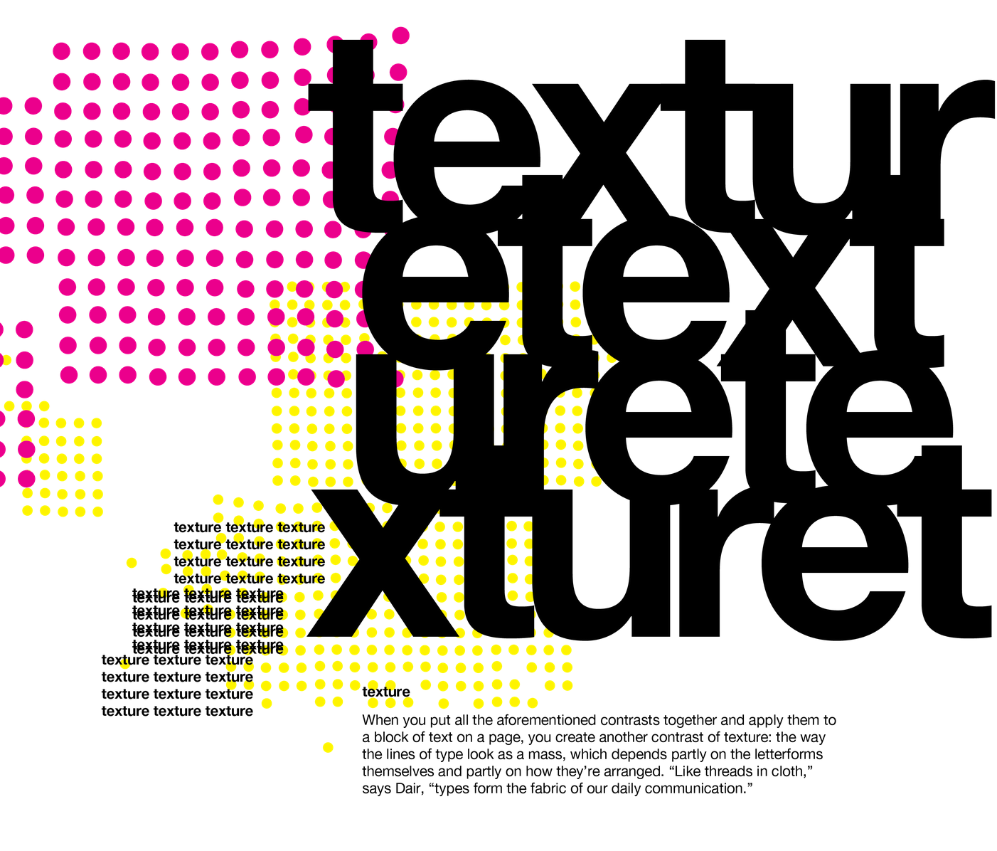
    1. Contrast of t
      exture: The overall visual appearance of text, considering size, weight, form, and structure.
  8. Fig. 1.19 Contrast of texture


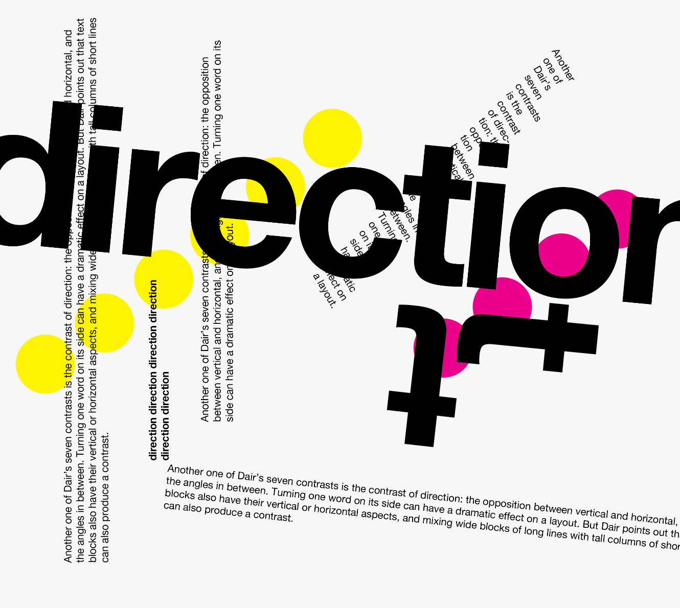
  9. Contrast of direction: Contrast in orientation, be it vertical, horizontal, or angled.
  10. Fig. 1.20  Contrast of direction
Contrast of color: The use of color, with attention to emphasizing specific elements.
  1. Fig. 1.21 Contrast of color


  2. Construction and considerations: Typography forms represent elements' overall look and feel, balancing harmony between function and expression. Typography, rooted in the Greek words "typos" and "graphics," represents a concept visually. Displaying type as a form highlights the unique characteristics of letterforms.

Organization / Gestalt: Perceptual Organisation / Groupings: Gestalt principles play a crucial role in organizing visual elements:

Fig. 1.22 Construction and Considerations

  • Law of Similarity: Similar elements are perceived as a unified group based on features like color, orientation, size, or motion.
  • Law of Proximity: Elements close together are perceived as a group, while those farther apart are less likely to be grouped.
  • Law of Closure: The mind tends to complete incomplete figures or forms, even with partial information.
  • Law of (Good) Continuation: Objects are perceived as distinct and uninterrupted, even when intersecting, based on their alignment.

In summary, the interplay of perception, contrast, and organization in typography creates a visually engaging and meaningful reading experience.


INTRODUCTIONS


Task 1: Exercise 1 - Typographic Systems

Task Requirements:
1. Use InDesign
2. Size: 200 x 200 mm
3. Can use one other color.
4. Less graphic elements.

My dream is to be a UX designer, but I am also interested in fashion, so I want to combine them. So, when you chose the one for a typo, I was interested in the title All Ripped Up: Punk Influences on Graphic Design.

Before starting this exercise, I decided to take some time to learn about punk design in more detail

The beginning of punk style, punk rock, was a subculture of the 70s, creating their own graphic style that was different from the mainstream, adopting a general Do It Yourself (DI) spirit to show autonomy from what was happening across the industry. Punk images used a variety of methods to show simple, dirty, and aggressive messages. This collage style suggested tearing up and starting over. This style takes a commercial image and repurposes it for revolutionary purposes. What I liked the most about punk style was that, after all, punk always brags about his shortcomings. For example, stencil text has a kind of gloss that almost changes the intent of the entire movement, although imperfections are a flaw. Punk style is not noble, but I think it has the power to change social problems humorously in its own way.
The two pictures below are the punk-style commercial ads created by modern computers and the digitization of funk

Fig. 2.1 Forever 21’s branding material for their 2013 punk collection

Fig. 2.2 Design for Good Form Salon by Roban

Week 1 - Practical

We took Lecture 1 in class and freely designed the layout with the axial system.
Using a digital collaboration platform called Miro, I received feedback from Mr Vinod in real-time and learned things to improve by looking at other friends' designs.


Fig. 2.3 Axial attempt in class #1, Week 1 (30/8/2023)

Fig. 2.4 Using MIRO to share ideas, Week 1 (30/8/2023)

In class, we learned from Mr. Vinod how to use different kinds of dash


-Various types of dash

1. Original dash -

2. n dash –

3. em dash —


Research


Fig. 2.5  Research, Week 1 (30/8/2023)

Sketch

Fig. 2.5 Sketch, Week 1 (30/8/2023)


InDesign Progress

Fig. 2.7  Creation process, Week 1 (30/8/2023)

Fig. 2.8  Modular system Creation process (grids and guides), Week 1 (30/8/2023)

Through feedback, I corrected the size-separated text too far away without using italics.
I learned various kinds of dashes and learned how to use the appropriate ones. After the first feedback, I decided to add color. I chose red to express the Punk

Fig. 2.9  Modular system after feedback (grids and guides) (6/9/2023)


Week 2 - attempts

Fig. 3.1 Part of the creation process, Week 2 (6/9/2023)


Fig. 3.2 Axial - revised, Week 2 (6/9/2023)


Fonts used:
Left: Gill Sans  (Bold, SemiBoldRegular)
Right: Futura (Condensed Medium, Bold, Condensed ExtraBold)


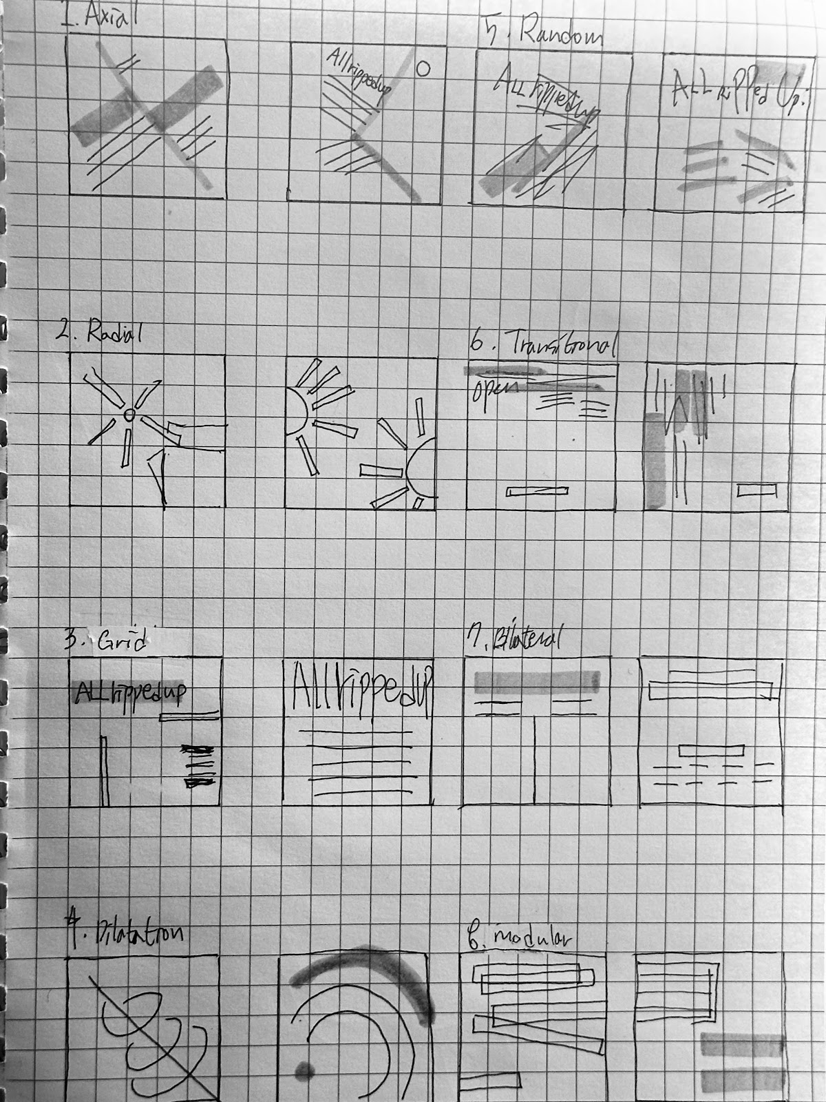
Fig. 3.3
 Radial - revised, Week 2 (6/9/2023)


Fonts used:
Left: Futura (Condensed Medium, Medium
Right: Helvetica  (Light, Regular, Bold) 


Fig. 3.4  - Dilatational revised, Week 2 (6/9/2023)

Fonts used:
Left: Gill Sans  (Light, Regular, Semi Bold) 
Right: Gill Sans  (Light, Regular, Semi Bold) 


Fig. 3.5 Random - revised, Week 2 (6/9/2023)


Fonts used:
Left:  ITC Garamond Std (Book, Bold, Light Condensed, Light)
Right: ITC Garamond Std(Ultra Condensed), Bodoni 72 (Book), Gill Sans(Bold), Helvetica (Light, Light Oblique, Bold), Bembo Std (regular), and Futura(Bold)

Fig. 3.6 Grid - revised, Week 2 (6/9/2023)


Fonts used:
Left: Futura (Condensed Medium, Medium
Right: ITC Garamond Std  (Ultra Narrow, Bold)

Fig. 3.7 Modular - revised, Week 2 (6/9/2023)


Fonts used
:
Left: Futura (Condensed Medium, Medium
Right: Futura (Condensed Medium, Medium

Fig. 3.8 Transitional - revised, Week 2 (6/9/2023)


Fonts used:
Left: Helvetica  (Light, Regular, Bold) 
Right: ITC Garamond Std  (Light, Light narrow, Ultra, Bold, Book Condensed)


Fig 3.9 Bilateral - revised, Week 2 (6/9/2023)


Fonts used:
Left: Futura (Condensed Medium, Medium
Right: Gill Sans (Light, Regular)


Final Task 1: Exercise 1 - Typographic Systems


Fig. 4.1 Grid - final, Week 2 (6/9/2023)


Fig. 4.2 Modular - final, Week 2 (6/9/2023)


Fig. 4.3 Axial - final, Week 2 (6/9/2023)


Fig. 4.4 Transitional - final, Week 2 (6/9/2023)


Fig. 4.5  -Dilatational final, Week 2 (6/9/2023)


Fig. 4.6  -  Bilateral final, Week 2 (6/9/2023)


Fig. 4.7  - Radial final, Week 2 (6/9/2023)


Fig. 4.8 Random - final, Week 2 (6/9/2023)


Fig. 4.9 Final Task 1 - Exercise 1: Typographic Systems - PDF, Week 2 (6/9/2023)


Fig. 4.10 Final Task 1 - Exercise 1: Typographic Systems(with grid) - PDF, Week 2 (6/9/2023)


Task 1:Exercise 2A -Type & Play

I was really interested and interested in the regularity I felt while designing the layout of the typo earlier. So naturally, as I came up with the idea for type and play, I thought of a Jigsaw puzzle.


Fig. 5.1 Chosen subject - jigsaw puzzle, Week 3 (6/9/2023)


Fig. 5.2 image trace - jigsaw puzzle, Week 3 (6/9/2023)

Fig. 5.3 Find a letter in jigsaw, Week 3 (6/9/2023)


Fig. 5.4 - Jigsaw puzzle shapes of various possibilities Week 3 (6/9/2023)


Reference

Oi chose it because the strokes were thick and the curves and perpendicular appearances, which are characteristic of the puzzle, were similar.

Fig. 5.5
 -Reference font Oi in Google font  (6/9/2023)

Fig. 5.6 -Reference font Oi in Google font  (6/9/2023)


I thought a lot about what to do with the baseline when I started because it was not a normal ratio of writing.

Fig. 5.7 -Reference font Oi in Google font  (6/9/2023)

Fig. 5.8-posting version "Finding Type artwork"(13/9/2023)

In order for the puzzle to fit well, we finally chose a straight version of the font because the surfaces that touch each other must be flat and angled together.
M actually altered the shape to make it look different from H and more intuitive


Fig. 5.9-Final Type Design H


Fig. 5.10
-
Final Type Design U


Fig. 5.11
-
Final Type Design A


Fig. 5.12
-
Final Type Design E


Fig. 5.13
-
Final Type Design M


Fig. 5.14 -Final letterforms on baseline (13/9/2023)

Fig. 5.15 -Final letterforms  PDF, Week 3(13/9/2023)


Exercise 2B -TYPE SHOWCASE 

Upon completing the letterform, we have to make a movie poster using the same visual and letterform.

Requirement:

  • The letterform has to interact with the visual
  • The size is 1024px X 1024px.

Image : 
Fig. 6.1-poster "Finding Type artwork" original photo Week 4 (13/9/2023)

I made it three-dimensional by adding a glow effect to make the typo and background picture look good. So, I added the Pixar logo below because I thought the 3D logo and Pixar among various movie companies were the most suitable for the atmosphere of this movie.

Fig. 6.2-poster "Finding Type artwork" Week 4 (13/9/2023)


Fig. 6.3 Final Finding Type artwork - PDF, Week 4 (13/9/2023)


FEEDBACK

Week 2 General Feedback: Distinguish exactly the criteria of the Bilateral Specific Feedback: Color is also a major factor in the layout. All elements must be expanded from a central point in a circular fashion, although it was a good attempt at Dilatational

Week 3 General Feedback: Each letter must be related and look like a family Specific Feedback: It's a good start because you can see the characteristics of the puzzle

Week 4 General Feedback: Find your own research image, find your meaning Specific Feedback: The wordmark needs stability and form,

REFLECTIONS

Experience:
After three weeks of coursework, I've garnered valuable experience in the realm of typographic hierarchy. This learning journey has shed light on how typographic choices significantly influence the viewer's experience. Notably, Task 1, Exercise 1 served as a profound learning opportunity. It illuminated the complexity of crafting layouts that engage viewers. While attempting to infuse motion into my layout, I faced considerable challenges. However, this experience has fueled my determination to improve, prompting me to embark on further research in pursuit of honing my skills.

Observations:
Throughout this course, I've observed that the strategic arrangement of text is pivotal for guiding the viewer's eye, emphasizing key elements, and establishing a logical flow within a design. Factors such as font size, weight, and color choices wield immense influence over how a message is perceived.

One particularly noteworthy observation is that working with fonts transcends mere aesthetics; it serves as a conduit for conveying specific messages and evoking emotions. Understanding the rationale behind selecting a particular font and how it aligns with the overarching design intent is of paramount importance.

Findings:
A major finding from this course is the realization that a strong conceptual foundation is indispensable in design. Designing without a well-thought-out idea can lead to superficial outcomes—resulting in mundane fonts that fall short of effectively conveying the intended message or concept. To create fonts that genuinely encapsulate our thoughts and intentions, it is imperative to develop a profound comprehension of their purpose and significance.

Additionally, I've come to appreciate the value of a learning-centered approach over a grade-centric one. Investing more time in projects and revisiting designs after a few days has proven to be an effective method for self-assessment and refinement. This practice has enabled me to identify areas for improvement and has been instrumental in achieving superior outcomes in my design endeavors.


FURTHER READINGS
Fig. 7.1 typographic design form and communication-Rob carter


Reading this book, it was good that I could review what I learned in class once more and learn more about what I didn't learn. Especially, it was easy to understand because it was organized in chronological order.


Fig. 7.2 The earliest writing of mankind

 
Fig. 7.3 What we learned in class about Russian constructivism and radial, grid

 
 Fig. 7.4 Eastern printing technology and modern digital writing


After learning the history of typography, I wonder how writing will change in the future. I think there could be a time when you don't type with your hands on the vending machine anymore.


Comments

Popular Posts