ADVANCED TYPOGRAPHY/ FINAL COMPILATION & REFLECTION

LIM CHAEHWAN / 0363792
Typography / Bachelor of Design in Creative Media (Hons) / Taylor's University
Final Compilation & Reflection
INSTRUCTIONS
Task 2: Key artwork(A) / Collateral(B)
Task 3: Type exploration & application
SUBMISSIONS
Task 1: Exercises: Typographic Systems / Type & Play
02.04.2023 – 20.09.2023 / Week 1 – Week 4
- Exercise 1A:Typographic Systems

Fig. 1.0 Grid - final, Week 2 (6/9/2023)

Fig. 1.1 Modular - final, Week 2 (6/9/2023)

Fig. 1.2 - Axial - final, Week 2 (6/9/2023)

Fig. 1.3 - Transitional - final, Week 2 (6/9/2023)

Fig. 1.4 - Dilatational final, Week 2 (6/9/2023)

Fig. 1.5 - Bilateral final, Week 2 (6/9/2023)

Fig. 1.6 - Radial final, Week 2 (6/9/2023)

Fig. 1.7 - Random - final, Week 2 (6/9/2023)
Fig. 1.8 Final Task 1 - Exercise 1: Typographic Systems - PDF, Week 2 (6/9/2023)
Fig. 1.9 Final Task 1 - Exercise 1: Typographic Systems(with grid) - PDF, Week 2 (6/9/2023)
- Exercise 2A:Type & Play

Fig. 2.0-Final Type Design H (13/9/2023)

Fig. 2.1-Final Type Design U (13/9/2023)

Fig. 2.3-Final Type Design A (13/9/2023)

Fig. 2.4 -Final Type Design E (13/9/2023)

Fig. 2.5-Final Type Design M (13/9/2023)

Fig. 2.7 -Final letterforms PDF, Week 3(13/9/2023)
-Exercise 2B: Type Showcase

Fig. 2.8 - Poster "Finding Type artwork" Week 4 (13/9/2023)
Fig. 2.9 - Final Finding Type artwork - PDF, Week 4 (13/9/2023)
29.06.2023 – 07.11.2023 / Week 5 – Week 9
-Task 2 (A): Key artwork
Key Artwork (KA) in BW & color


Fig. 3.3 Final key artwork - PDF (Week 7, 4/10/23)
-Task 2 (B): Collateral
IG Account
Final IG handle

Fig. 3.4 Instagram - Profile icon (Week 7, 4/10/23)

Fig. 3.5 Instagram - post 1 (Week 7, 4/10/23)

Fig. 3.6 Instagram - post 2 (Week 7, 4/10/23)

Fig. 3.7 Instagram - post 3 (Week 7, 4/10/23)

Fig. 3.8 Instagram - post 4 (Week 7, 4/10/23)

Fig. 3.9 Instagram - post 5 (Week 7, 4/10/23)

Fig. 3.10 Instagram - post 6 (Week 7, 4/10/23)

Fig. 3.11 Instagram - post 7 (Week 7, 4/10/23)

Fig. 3.12 Instagram - post 8 (Week 7, 4/10/23)
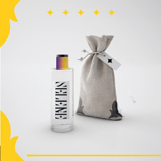
Fig. 3.13 Instagram - post 9 (Week 7, 4/10/23)
Fig. 3.14 Final Animation gif (Week 8, 11/10/23)
Fig. 3.15 Final Task 2B - PDF (Week 8, 11/10/23)
Task 3:Type exploration & application
07/11/2023 – 29/11/2023 / Week 9 – Week 14
PROPOSAL
Fig. 4.0 Proposal presentation (Week 9)

Fig. 4.1 Selected idea (Week 9)
Video
Fig 4.2 Participant reaction video on the second day of the experiment (Week 12)

Fig 4.3 Final Infographics (Week 13)
Final Work Compilation
Fig 4.4 Final Work Compilation (Week 13)
REFLECTION
Experience
Embarking on this typography journey has been a rich and immersive experience. The exploration of typographic hierarchy, the creation of a personal wordmark, and the typography experiment with the typo box have collectively contributed to a profound learning adventure. Each activity presented unique challenges and opportunities, allowing me to delve into the intricacies of typography and its multifaceted role in design.
The process of creating my wordmark, "Selene," was particularly exciting, providing a platform for artistic self-expression. Distilling my personality into design felt akin to crafting personalized merchandise, infusing an element of enjoyment and fulfillment into the creative process. The typo box experiment added another layer of interest, unveiling the impact of font design on user perception and challenging preconceived biases.
Observations
Throughout these activities, keen observations have unveiled the nuanced dynamics of typography. The typographic hierarchy exploration highlighted the pivotal role of strategic text arrangement in guiding viewer experience. Crafting a personal wordmark underscored the importance of continuity and purpose in design expansion. The typo box experiment, meanwhile, accentuated the significance of user perception, readability, and the tactile aspect of typography.
Notably, the observations revealed that typography transcends mere aesthetics—it serves as a conduit for conveying messages, evoking emotions, and influencing user interactions. The interplay between visual elements and user experience became evident, emphasizing the intricate relationship between design choices and the perception of the intended message.
Findings
The culmination of these experiences and observations has led to valuable findings. The typo box experiment, in particular, highlighted the delicate balance required in design expansion—maintaining continuity while introducing new elements. It emphasized that successful design is not only about creating visually pleasing visuals but also about crafting a comprehensive and purposeful narrative that seamlessly evolves.
Moreover, the collective experience underscored the importance of a strong conceptual foundation in design. Whether exploring typographic hierarchy or creating a personal wordmark, having a clear intention and rationale behind design choices is indispensable. The findings reaffirm that effective typography goes beyond surface-level aesthetics; it involves a harmonious interplay of elements that shape a compelling and dynamic visual story.
In conclusion, this typography journey has been a mosaic of experiences, observations, and findings, contributing to a deeper understanding of the art and science of typography. It has fostered a holistic perspective that appreciates the intersection of creativity, purpose, and user experience in the dynamic world of design.


Comments
Post a Comment